When i set out to redesign the logo and packaging for the brand I initially tried to keep some of the old logo elements. I played around with keeping the dragon logo, but in a more modern design as shown below. I was also playing around with keeping the green logo colour that the current packaging is known for.

Above are some of the iterations i tried to make work with the dragon central in the logo. I have been designing the logo in InDesign with the possibility to make vector based logos, which in turn makes it easier to make many different options while still being able to change individual parts of the logo at any given time. I didn’t really like the look of the first iterations of the logo as it felt too blocky and the green colour felt distracting. One of my first 3D renders (as seen below) included a different bottle shape as that is what was available to me through Adobe Dimension. In this render I placed the dragon on its own in the top part of the bottle, which still didn’t feel like it was showing off the London heritage enough. I need the design to portray London heritage without the person needing to know the full history behind symbols such as this dragon. The lower part of the bottle, where the information is placed, i got inspiration from the new Stones ginger gin bottle.

Looking at the renders and current stage of logo creation, i didn’t feel like i had created a good enough logo that could be used across the whole branding. It simply felt a little too fragmented, and the dragon still felt confusing.
This is when i moved on from the idea of the dragon to thinking about different icons that could symbolise London. I settled on the iconic Big Ben for the fact its known by people from all over the country and the world as being a famous London landmark.

Moving from the top left corner i started playing with the icon of Big Ben, as well as how to incorporate “Stone’s” into the icon itself. My main goal with this was to create a single logo that can work across all different types of packaging as well as media and communications. I also played around with a vertical version of the logo where the big ben would be positioned above the logo text. In the end i decided to keep it simple and stick to one version of the logo across all parts of the brand in order to keep consistency. I also attempted to include some colour into the logo, but for the same reason decided to keep it simple with just one colour across the whole logo at any given time, being either black or white.

Once i had the logo finished i went on to create a 3D version of the bottle in order to visualise how the new logo and elements would look together. Within the 3D software it was easy to play around with different colours and textures for the glass bottle, as well as the placements of the different bottle elements. The 3D models was created using Adobe Photoshop, and was traced from the current stones bottle shape.


The following is multiple versions of 3D renderings i did during the design process:
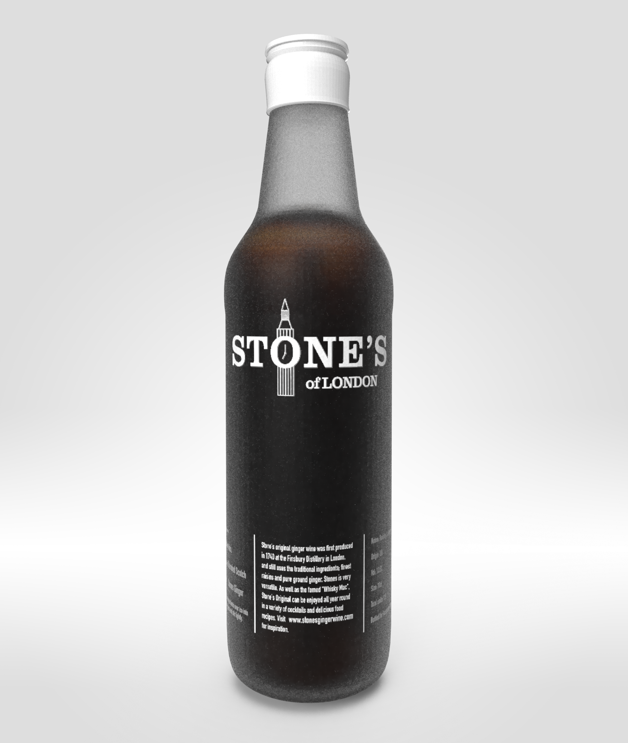
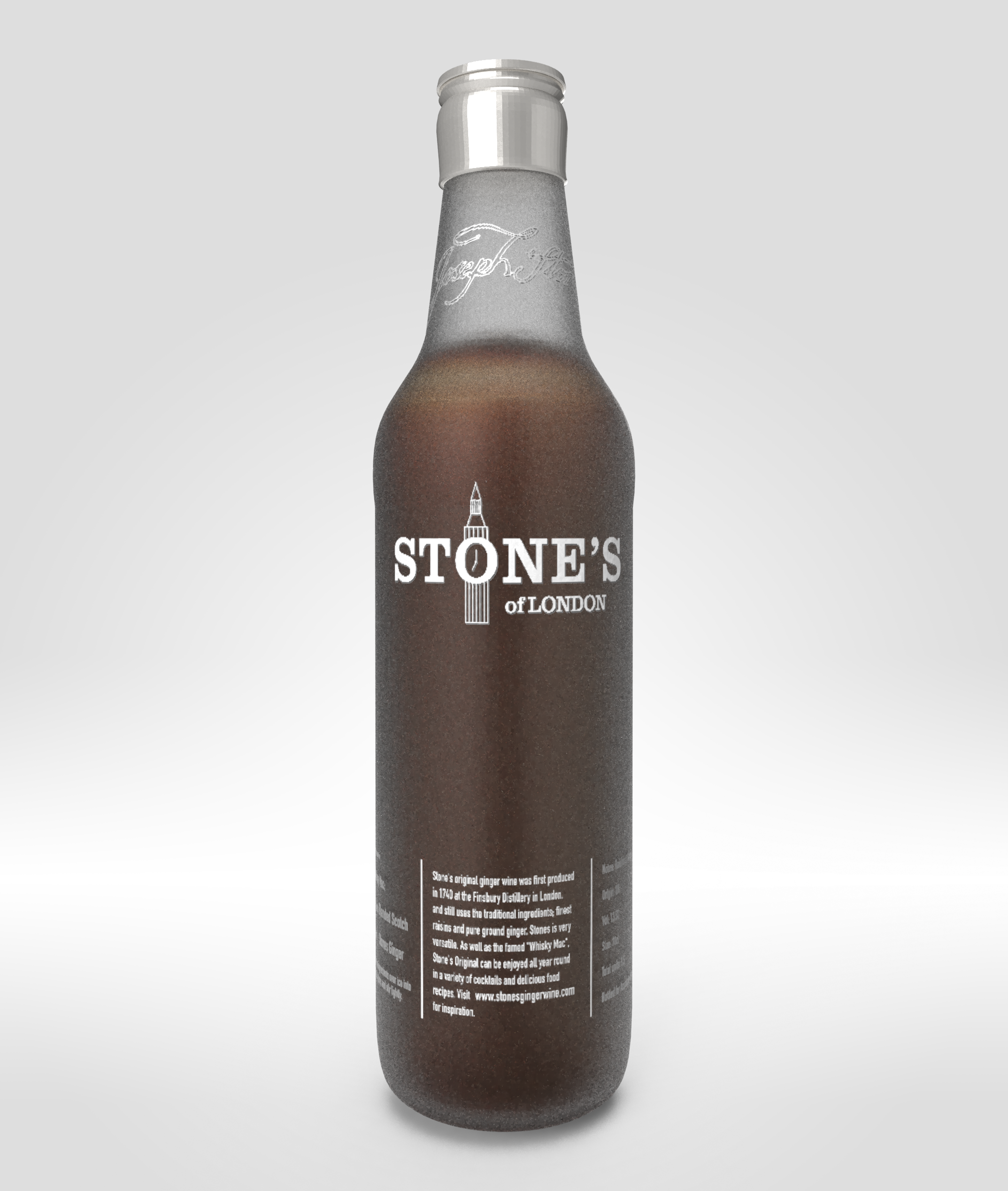


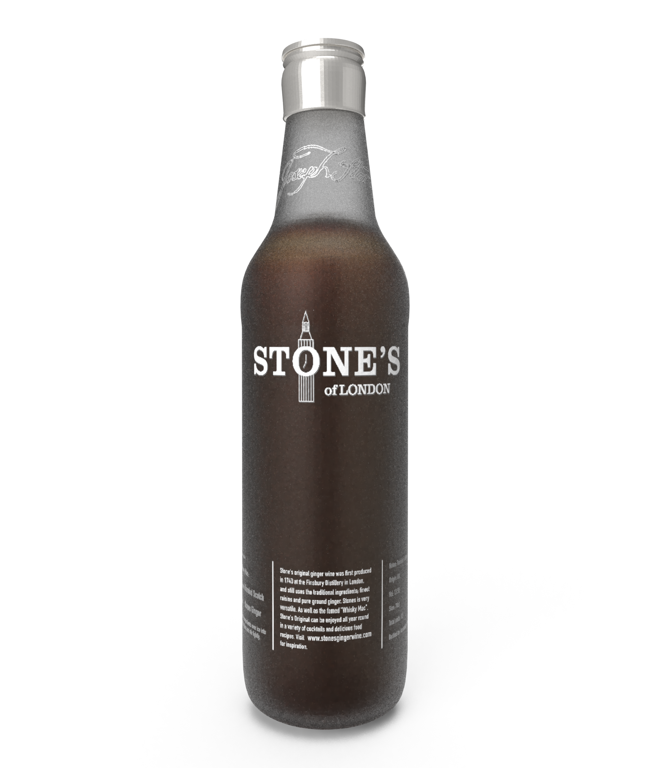

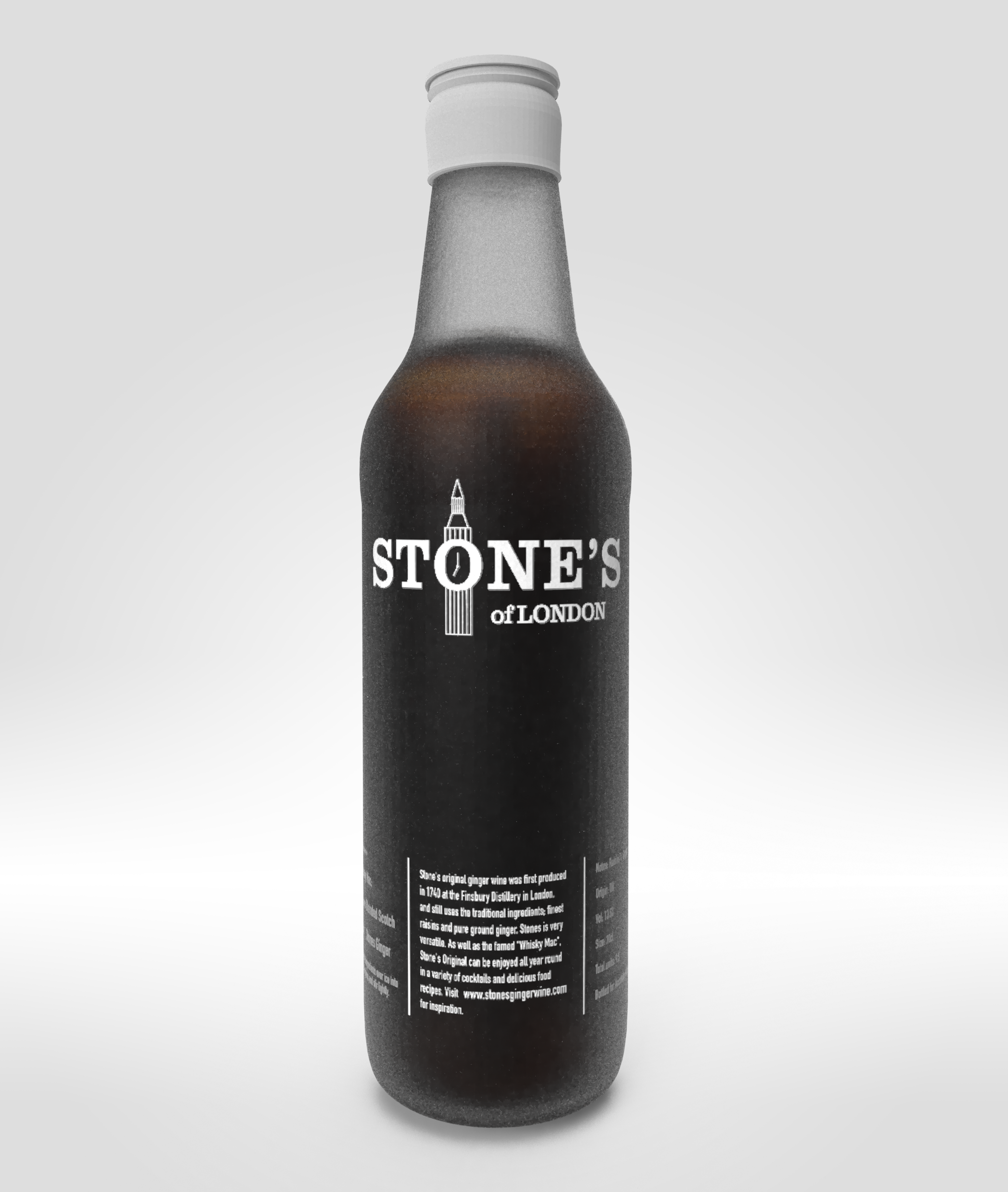

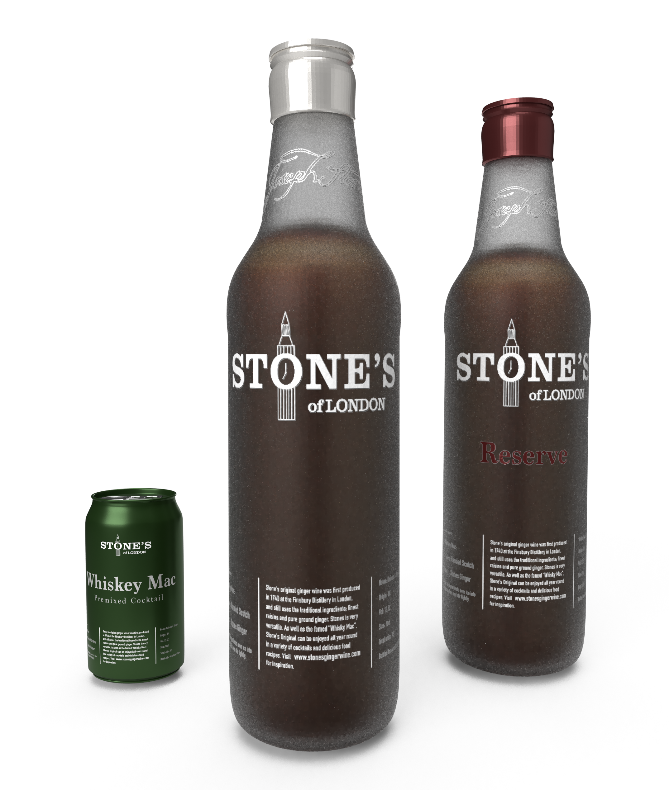
I tried many different variations of the bottle itself without rendering, and settled on the frosted glass seen above. I also added a little black to the bottle colour in order for the bottle elements to pop better.
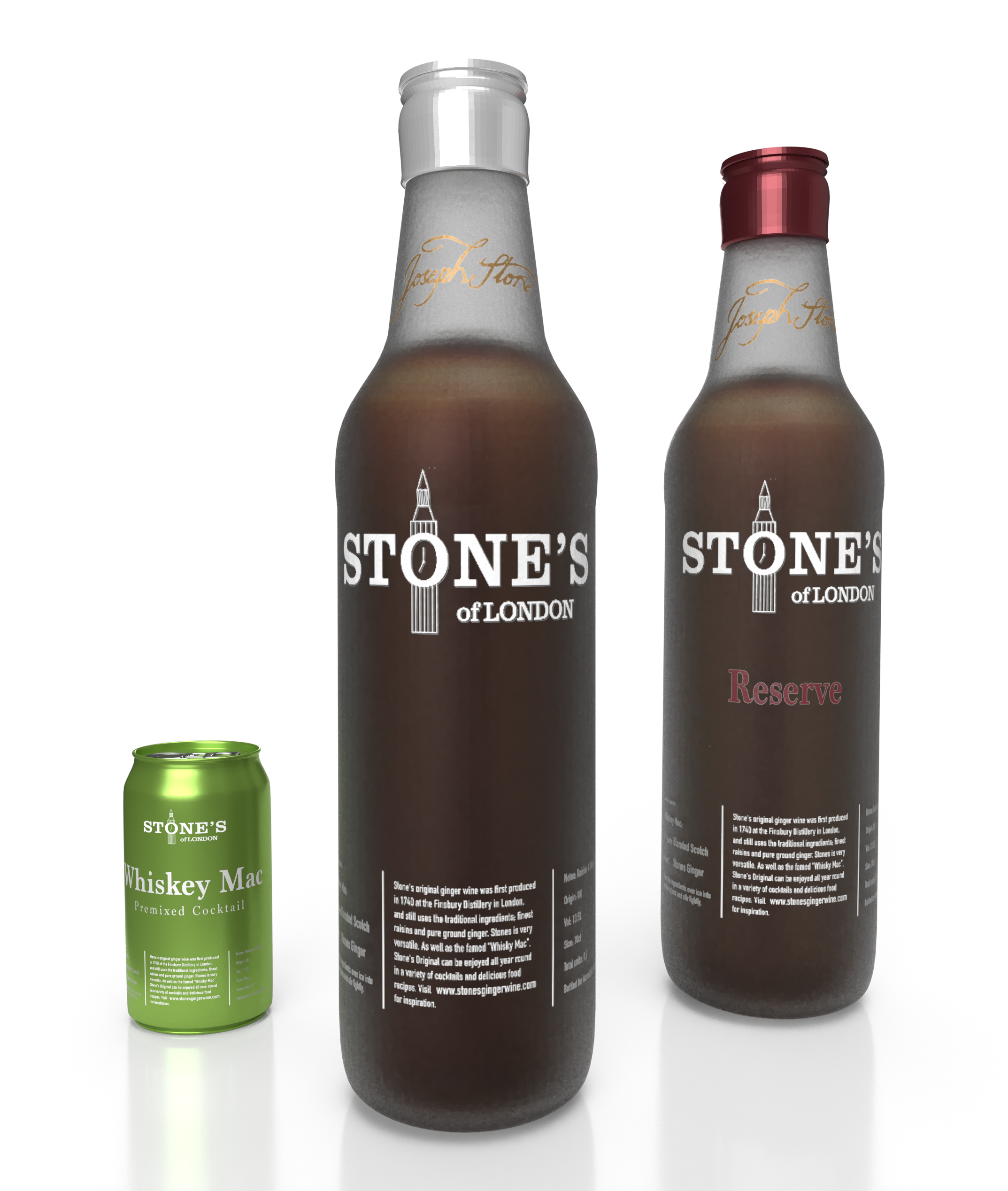
The above design is the final version of the bottle, in addition to mockup designs of the Reserve as well as a potential premixed cocktail box. We can see that the signature at the top of the bottle is made in a gold colour, this is a way to keep some of the old brand elements from the previous bottle.