Final brand strategy

To tie all of the previous blogs together i will now focus on the final brand strategy as outlined in the Branding Guide. The brand has now got a new logo that will work across all different usage scenarios that clearly focuses on its London heritage by using Big Ben through the logo as well as using the “of London” text that further explains the heritage if people are unfamiliar with Big Ben. We have simplified most of the design elements within the brand both on packaging as well as online. The branding guide also focuses on the tone of voice being one of aspirational sophistication while not being snobby, this means that the new brand as a whole will appeal to a wider target audience.

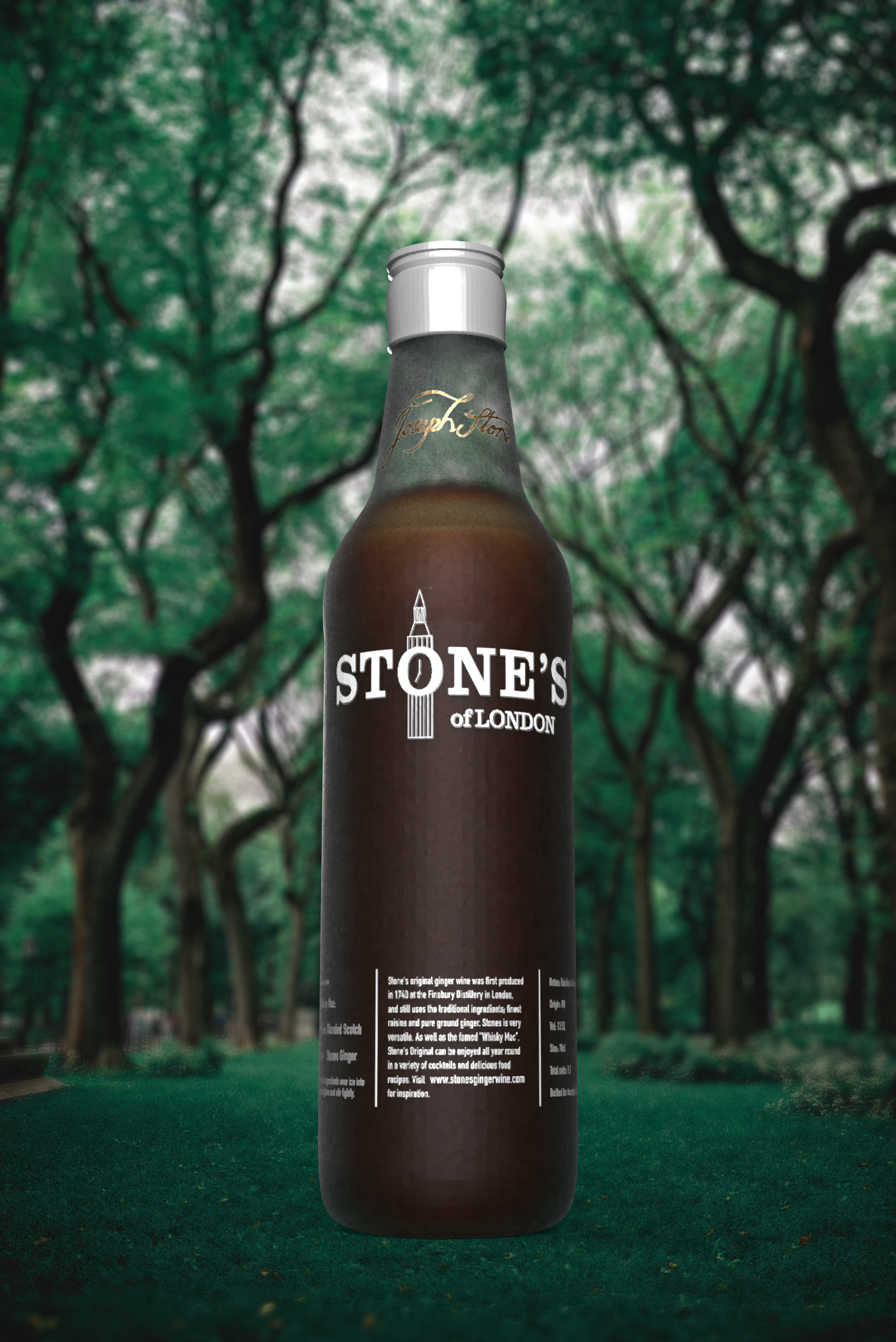
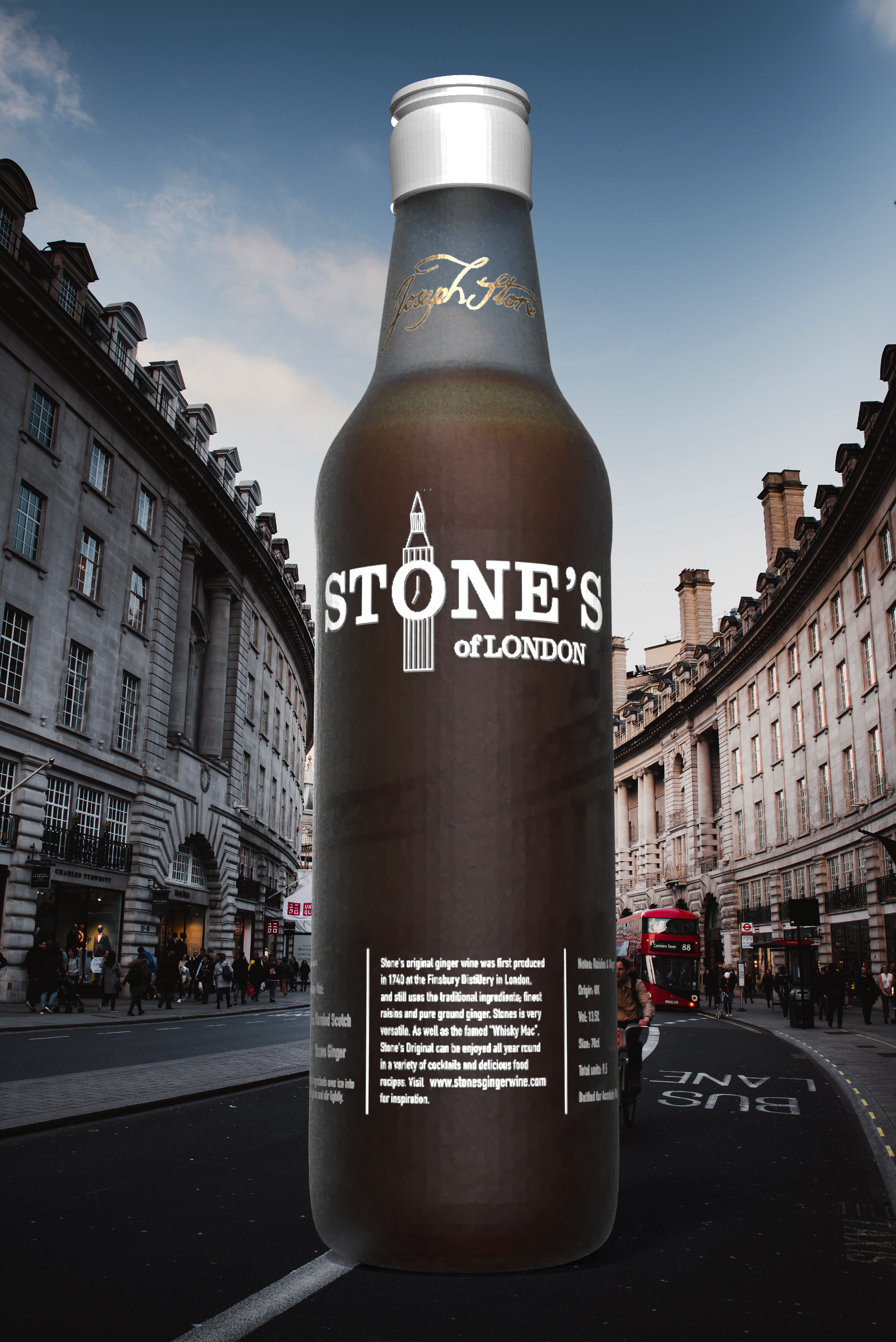
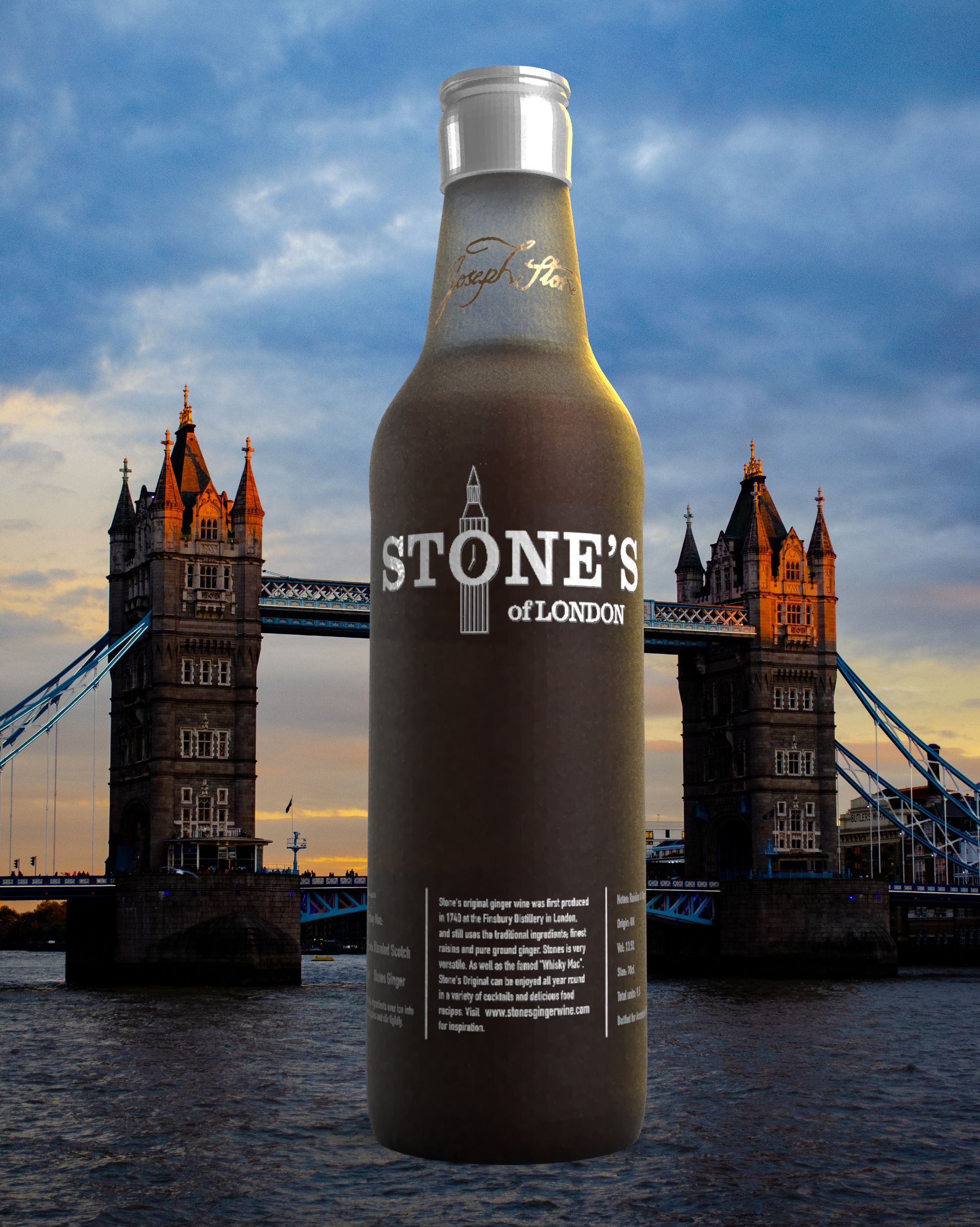
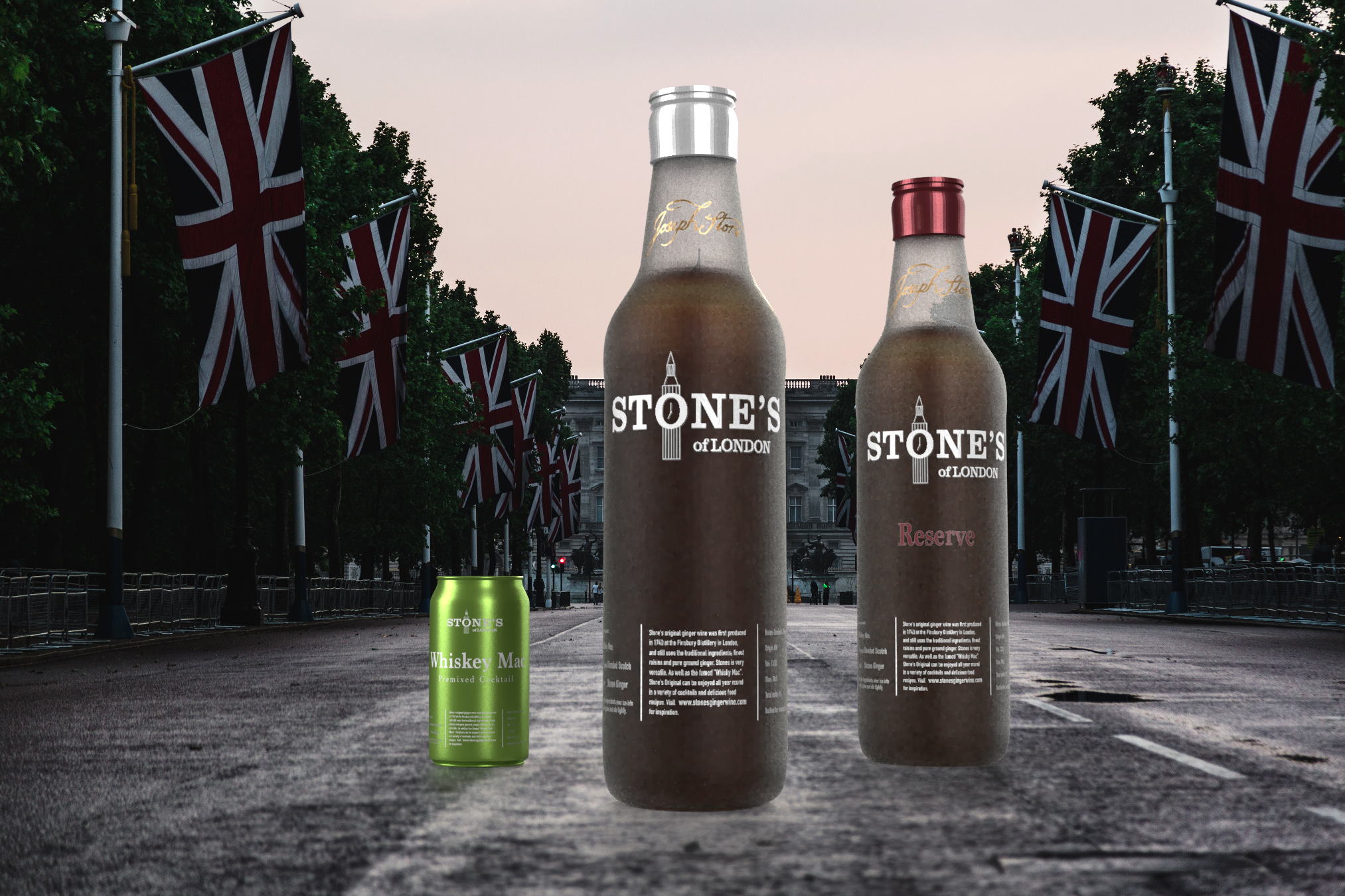
The focus on the geographical heritage of the product is followed through into the type of imagery that will be used across communications. The below mockups show the bottle being prominently displayed within a typical London scenery. These images are to be used across both digital advertising as well as print advertising when launching the new bottle design

In addition to mocking up the packaging of the products, i have also used Squarespace to mock up a new website for the brand. I focused on keeping it simple to match the rest of the branding, with lots of space and utilising the brand colours within the website. It can be seen below in different versions for different screen types:

Outdoor advertising could look like below. Keeping it simple and use the bottle design as the main feature of the advertising with a hint of london in the background.


Process of designing the visuals
When i set out to redesign the logo and packaging for the brand I initially tried to keep some of the old logo elements. I played around with keeping the dragon logo, but in a more modern design as shown below. I was also playing around with keeping the green logo colour that the current packaging is known for.

Above are some of the iterations i tried to make work with the dragon central in the logo. I have been designing the logo in InDesign with the possibility to make vector based logos, which in turn makes it easier to make many different options while still being able to change individual parts of the logo at any given time. I didn’t really like the look of the first iterations of the logo as it felt too blocky and the green colour felt distracting. One of my first 3D renders (as seen below) included a different bottle shape as that is what was available to me through Adobe Dimension. In this render I placed the dragon on its own in the top part of the bottle, which still didn’t feel like it was showing off the London heritage enough. I need the design to portray London heritage without the person needing to know the full history behind symbols such as this dragon. The lower part of the bottle, where the information is placed, i got inspiration from the new Stones ginger gin bottle.

Looking at the renders and current stage of logo creation, i didn’t feel like i had created a good enough logo that could be used across the whole branding. It simply felt a little too fragmented, and the dragon still felt confusing.
This is when i moved on from the idea of the dragon to thinking about different icons that could symbolise London. I settled on the iconic Big Ben for the fact its known by people from all over the country and the world as being a famous London landmark.

Moving from the top left corner i started playing with the icon of Big Ben, as well as how to incorporate “Stone’s” into the icon itself. My main goal with this was to create a single logo that can work across all different types of packaging as well as media and communications. I also played around with a vertical version of the logo where the big ben would be positioned above the logo text. In the end i decided to keep it simple and stick to one version of the logo across all parts of the brand in order to keep consistency. I also attempted to include some colour into the logo, but for the same reason decided to keep it simple with just one colour across the whole logo at any given time, being either black or white.

Once i had the logo finished i went on to create a 3D version of the bottle in order to visualise how the new logo and elements would look together. Within the 3D software it was easy to play around with different colours and textures for the glass bottle, as well as the placements of the different bottle elements. The 3D models was created using Adobe Photoshop, and was traced from the current stones bottle shape.


The following is multiple versions of 3D renderings i did during the design process:
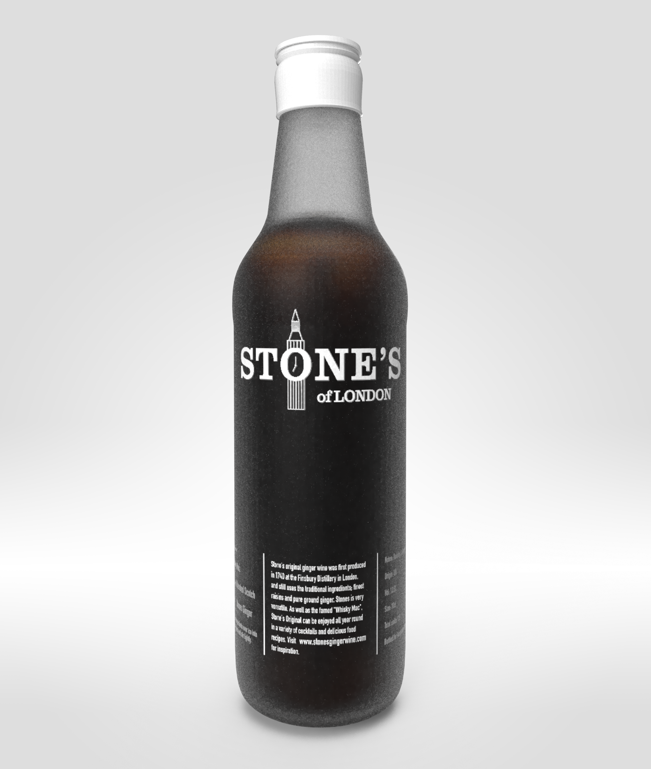
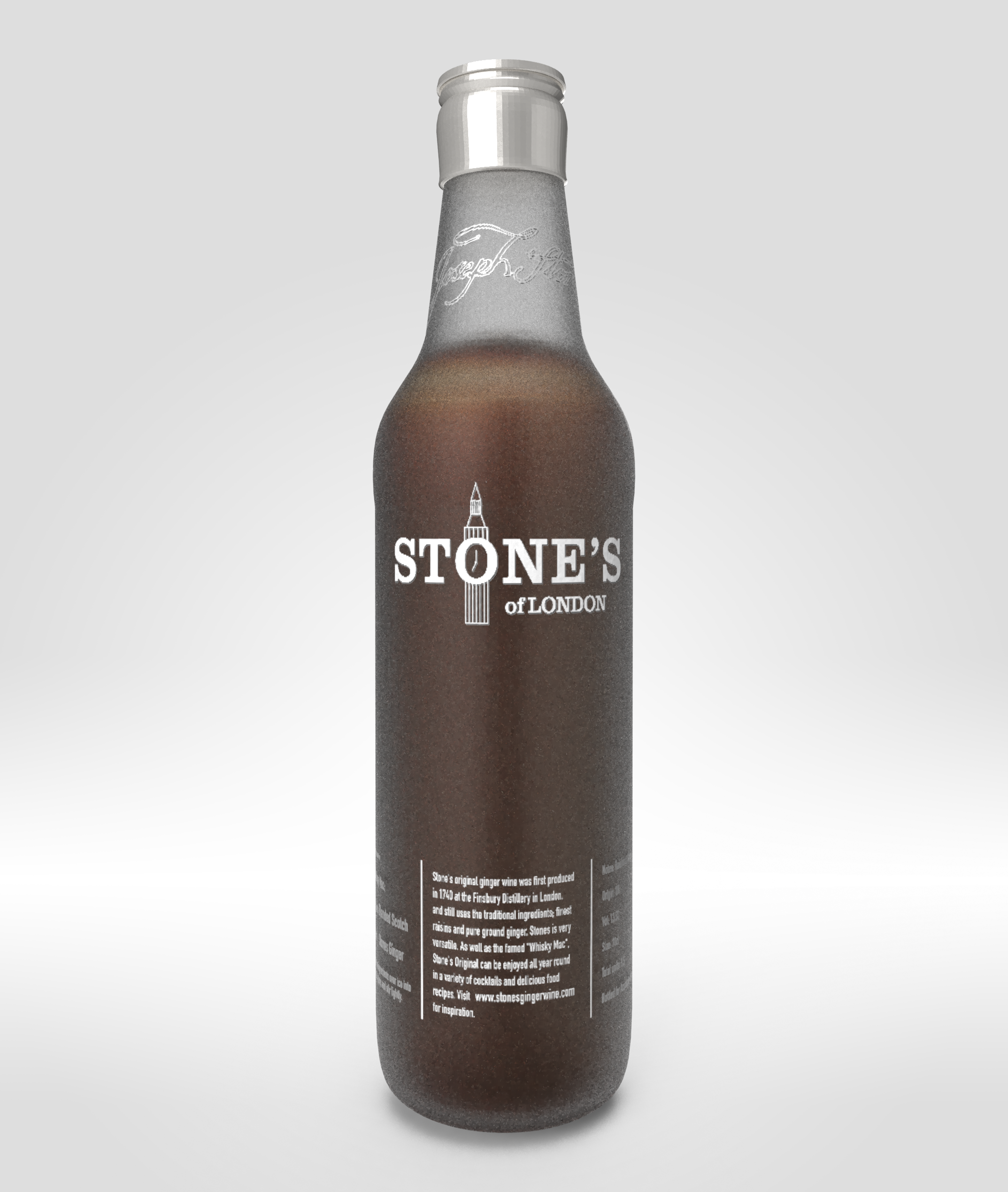


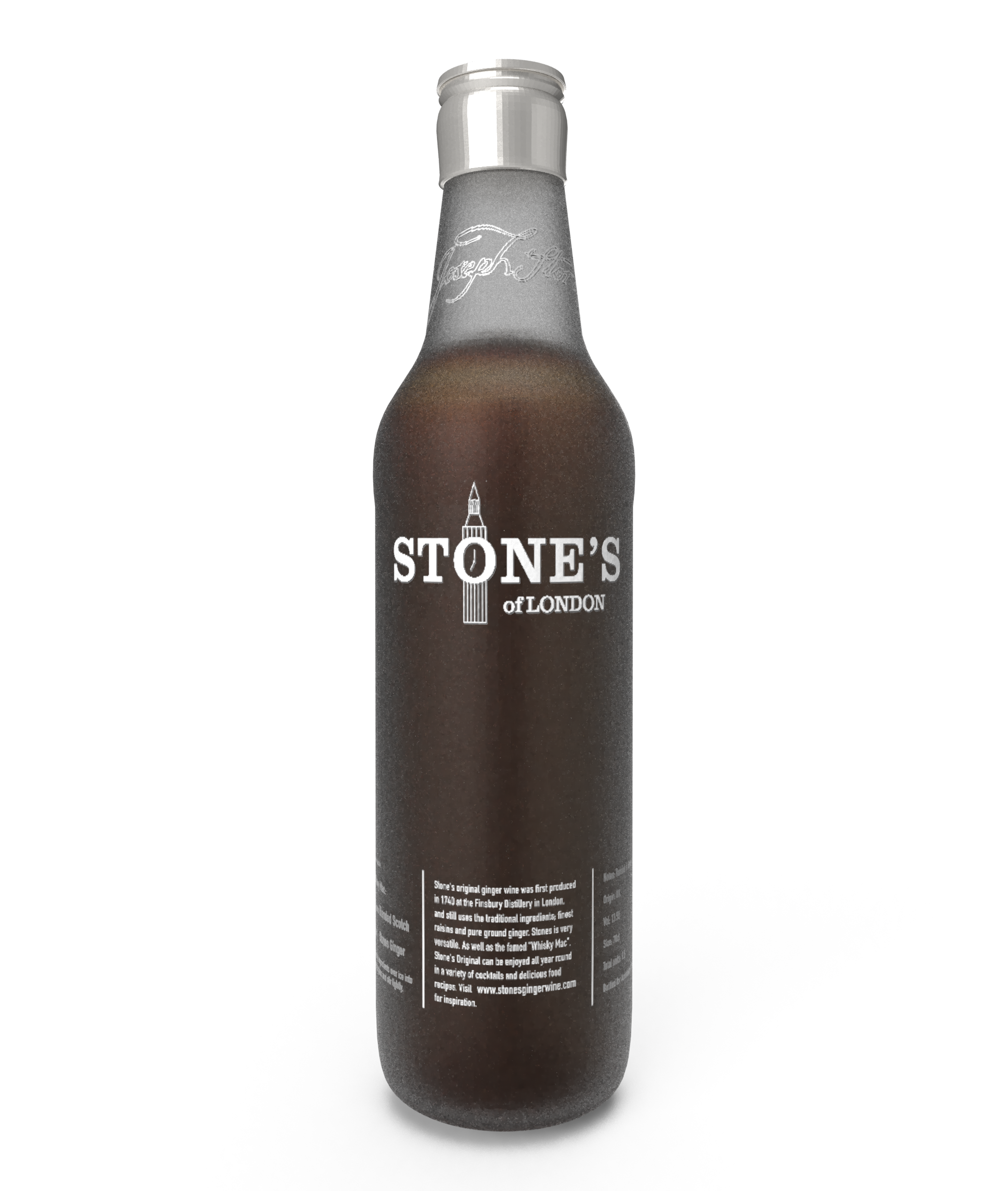
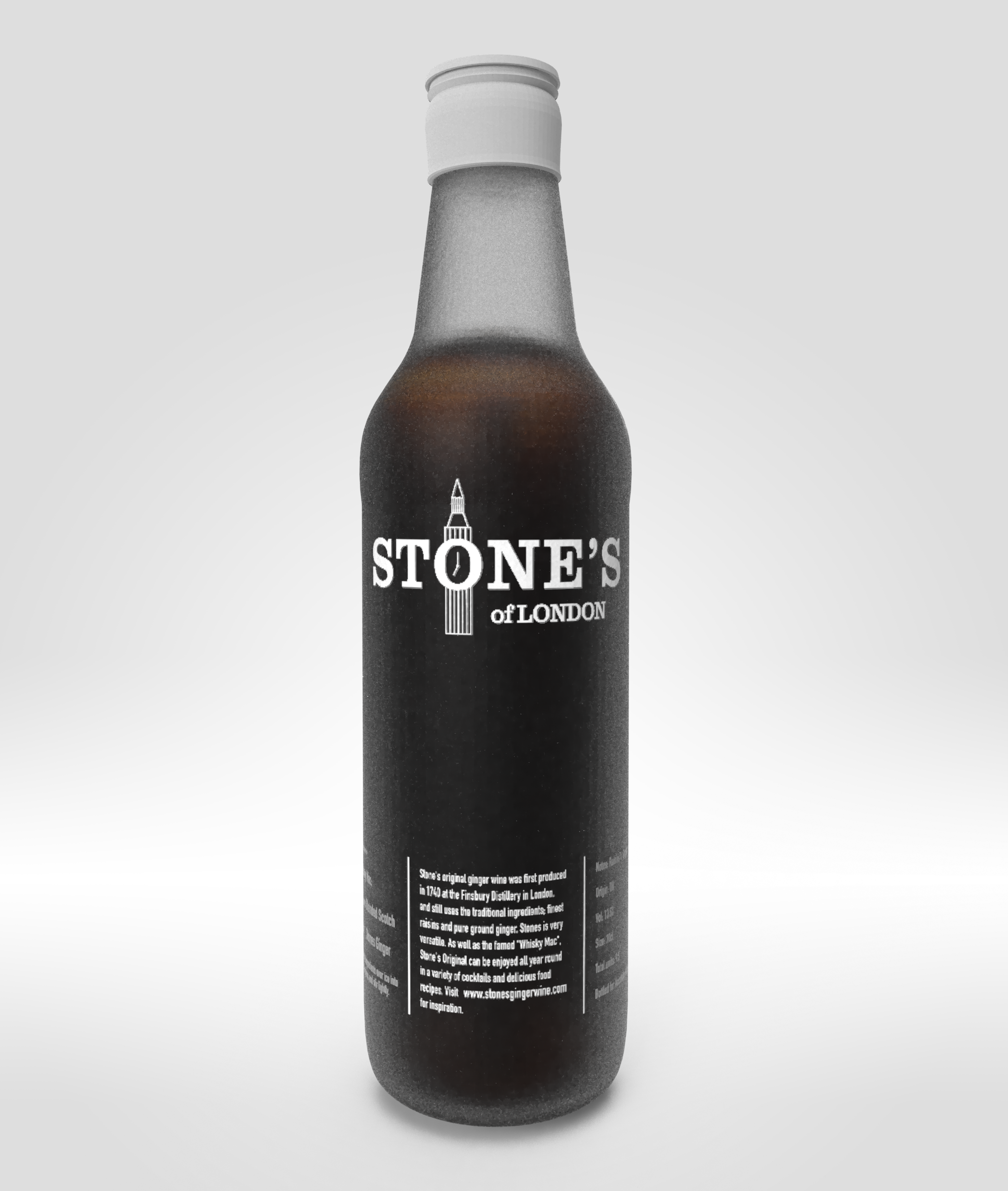

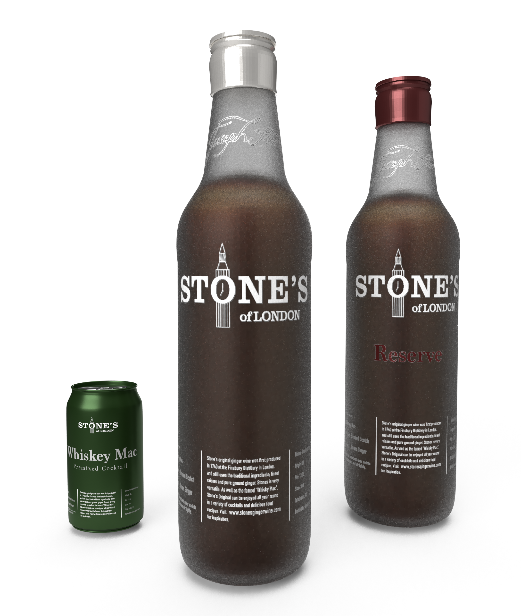
I tried many different variations of the bottle itself without rendering, and settled on the frosted glass seen above. I also added a little black to the bottle colour in order for the bottle elements to pop better.
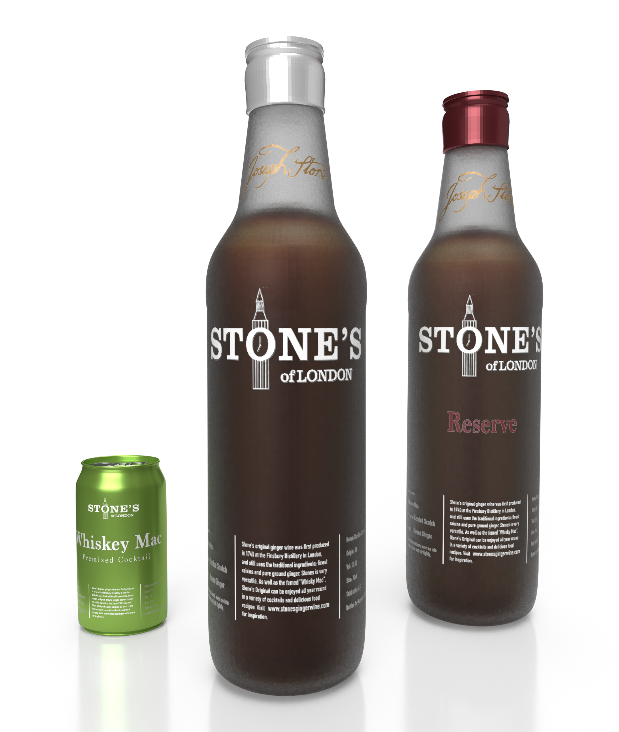
The above design is the final version of the bottle, in addition to mockup designs of the Reserve as well as a potential premixed cocktail box. We can see that the signature at the top of the bottle is made in a gold colour, this is a way to keep some of the old brand elements from the previous bottle.
Problems with the Stone's Ginger Wine brand
Through the coming blog posts, I will explain some of the thinking that has gone into the redesign of "Stone's Green Ginger Wine"(later referred to as Stone's) brand. The client expressed concern over the fact that most of their yearly sales happen during the 12 weeks of Christmas. They also informed us that the average buyer of Stone's only buys one bottle in a year, and is 65+. This fact is concerning as the regular consumers of the product buy very little and are ageing.


We conducted primary research to gain an understanding about peoples perceptions of the brand and product. Through the focus group(7 people aged 26-56 year old, Dec 18) and online questionnaire(37 participants, Dec 18), we found that the perceptions of the brand and product matched up to the purchase patterns and typical consumer. People had many negative associations with the drink and packaging, many stating that the brand felt old, Christmassy and cheap. Many were also in a state of confusion as to what green ginger wine is and how the drink could be consumed.
When the bottle was given to our focus group attendants, many negative comments were being made about the design of the branding and the bottle. It was described as cheap due to its green tinted bottle, and Christmassy due to its very busy and old themed label. The label has lots of design elements that feel festive, especially the squiggly lines around the outside and the green/gold colour combination.
As a whole, very few of our participants knew about the brand or the product category at all. There is therefore little brand equity amongst people who aren't currently regular purchasers of the product. This could be down to the fact that there has been very little marketing activity in the last years on the product. When researching past activity the last larger scale marketing effort was in the 80s with a TV advertisement.
The current Stone's logo has clear symbolism towards its London heritage. The logo itself has the London dragon crest built into it, but when asking our focus group participants about their knowledge of this connection there was very little knowledge.
Looking at the alcoholic drinks market in the UK, we can see that spirits is the fastest growing category(Statista, 2019). Therefore focusing on aligning the product with the spirits market would see an opportunity to tag along on this growth. Since stones is a drink that is mostly used as a cocktail ingredient it has many similarities with spirits, and is often even mixed with spirits. Looking at a target audience that is interested in cocktails is therefore something to look into.
The conclusion about the current brand and its brand elements is that there is generally lots of confusion and negativity tied to it. People imagine the drink being an old person's drink, which in turn will repel younger people from buying the product. This primary research, therefore, leads us to believe that the brand needs a serious revamp and modernisation to appeal to a larger and somewhat younger target audience.
References:
Statista (2019) Alcoholic drinks. Available at: https://www.statista.com/outlook/10000000/156/alcoholic-drinks/united-kingdom?currency=gbp#market-revenue (Accessed: 14 March 2019)
Proposed changes to the current brand
As shown in the previous blog post, the Stone's ginger wine brand needs a substantial overhaul to solve the client's problem around its usage and purchase pattern surrounding the 12 weeks of Christmas. Since there is little knowledge about the current brand and its elements, it would be more effective to focus on creating new elements rather than just invigorating old ones(Keller, 1999).
We found, through primary research, that the brand elements represents the current buyer and purchase pattern of the product. Which means that people perceived it to be old and festive, which lines up with the issue of the core consumers purchasing rarely and being ageing. Although an age target might not be necessary due to the product potentially appealing to a type of person rather than an age, it is necessary to make the look and feel of the brand more relatable to a wider target audience who consumes larger quantities of cocktails and therefore cocktail ingredients. Especially the bottle design needs to be something a cocktail lover would be proud to have displayed in their liquor cabinet. In practice this means looking into changing the bottle colour to something more neutral than the current green, which reminded people of “cheap beer”. The brand elements on the bottle also needs simplification, as it is currently very busy, something the focus group participants also agreed with. Although we will be looking into keeping some of the elements, there has been a consensus that most elements needs to go or be modernised. Therefore to appeal to a younger audience who enjoys making cocktails and seeks experiences we should modernise the whole brand, from how we communicate to the bottle design and logo.
The bottle and logo has the historic London crest with dragons next to a shield, this has been done to appeal to the long standing heritage of the product and brand. As mentioned in the previous blog post, many people didn’t know that’s what it meant. This means that the London heritage might not come across to people who are unfamiliar with the historic elements of London. Through the design process we will be looking into either simplifying the dragon shield or simply find new elements that can represent the history of the drink.
Another confusing element of the brand and packaging is down to the ginger wine label. Wine made from grapes is a massive category within the alcoholic drinks market, this is where the confusion of what ginger wine comes from. Since ginger wine is made from raisins rather than fresh grapes, it has more connection to the fortified wine market than wine itself. Our primary research found that people where generally confused as to what ginger wine is and how to consume it. The low knowledge of the category means that it might be better for the Stones ginger wine be known for its brand name rather than what product category it comes from. Looking at other mixer drinks such as Apperol and Pimms, we can see that there is very little focus on the type of product it contains as opposed to focusing on the brand name and its usage scenarios.
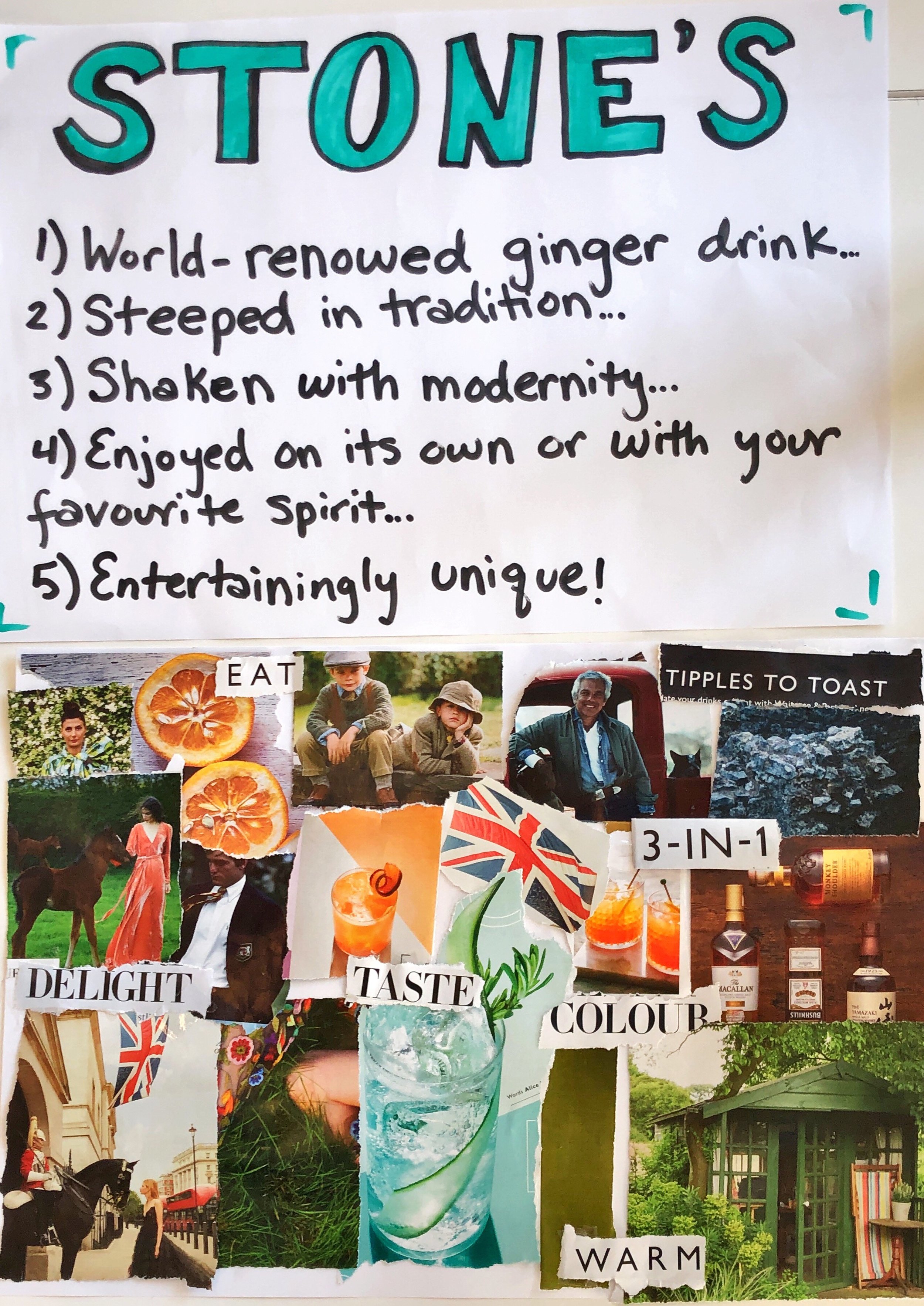
In one of our sessions we created a mood board that represents where we would like to take the brand. As seen by the picture it is focusing on modern English heritage without feeling old, as well as focusing more on food and drinks lovers.
References:
Keller, K. L. (1999) ‘Managing brands for the long run’, California Management Review, 41(3), pp. 102–124.