Proposed changes to the current brand
As shown in the previous blog post, the Stone's ginger wine brand needs a substantial overhaul to solve the client's problem around its usage and purchase pattern surrounding the 12 weeks of Christmas. Since there is little knowledge about the current brand and its elements, it would be more effective to focus on creating new elements rather than just invigorating old ones(Keller, 1999).
We found, through primary research, that the brand elements represents the current buyer and purchase pattern of the product. Which means that people perceived it to be old and festive, which lines up with the issue of the core consumers purchasing rarely and being ageing. Although an age target might not be necessary due to the product potentially appealing to a type of person rather than an age, it is necessary to make the look and feel of the brand more relatable to a wider target audience who consumes larger quantities of cocktails and therefore cocktail ingredients. Especially the bottle design needs to be something a cocktail lover would be proud to have displayed in their liquor cabinet. In practice this means looking into changing the bottle colour to something more neutral than the current green, which reminded people of “cheap beer”. The brand elements on the bottle also needs simplification, as it is currently very busy, something the focus group participants also agreed with. Although we will be looking into keeping some of the elements, there has been a consensus that most elements needs to go or be modernised. Therefore to appeal to a younger audience who enjoys making cocktails and seeks experiences we should modernise the whole brand, from how we communicate to the bottle design and logo.
The bottle and logo has the historic London crest with dragons next to a shield, this has been done to appeal to the long standing heritage of the product and brand. As mentioned in the previous blog post, many people didn’t know that’s what it meant. This means that the London heritage might not come across to people who are unfamiliar with the historic elements of London. Through the design process we will be looking into either simplifying the dragon shield or simply find new elements that can represent the history of the drink.
Another confusing element of the brand and packaging is down to the ginger wine label. Wine made from grapes is a massive category within the alcoholic drinks market, this is where the confusion of what ginger wine comes from. Since ginger wine is made from raisins rather than fresh grapes, it has more connection to the fortified wine market than wine itself. Our primary research found that people where generally confused as to what ginger wine is and how to consume it. The low knowledge of the category means that it might be better for the Stones ginger wine be known for its brand name rather than what product category it comes from. Looking at other mixer drinks such as Apperol and Pimms, we can see that there is very little focus on the type of product it contains as opposed to focusing on the brand name and its usage scenarios.
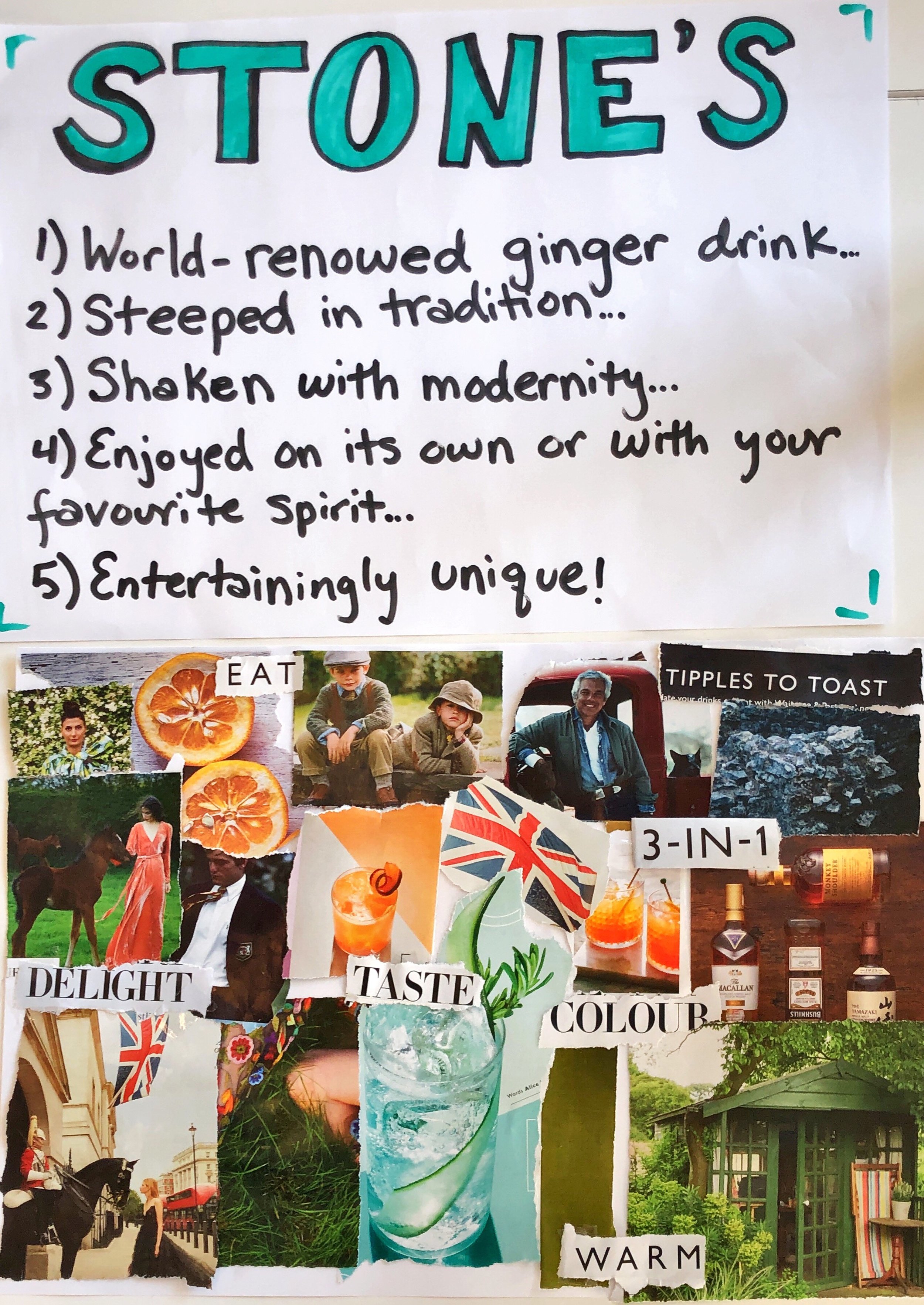
In one of our sessions we created a mood board that represents where we would like to take the brand. As seen by the picture it is focusing on modern English heritage without feeling old, as well as focusing more on food and drinks lovers.
References:
Keller, K. L. (1999) ‘Managing brands for the long run’, California Management Review, 41(3), pp. 102–124.